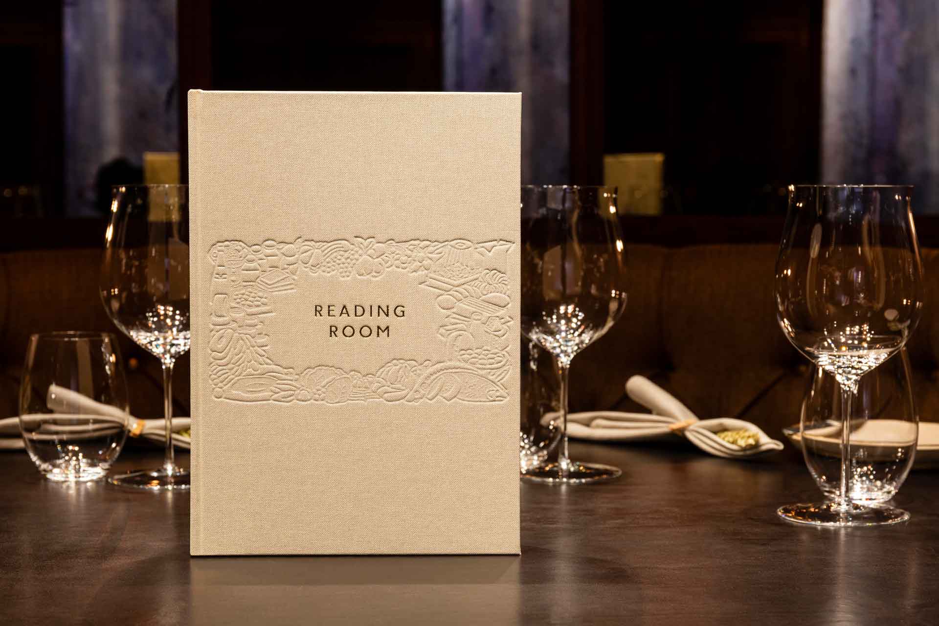
Here Design is the East-London multidisciplinary studio behind some of the most recognised brand identities from the likes of Hauser & Wirth and its Fife Arms Hotel, to LVMH, Lina Stores, Bacardi, Panzers, The Balvenie, Fortnum & Mason and many more.
Established in 2005 by co-founders Kate Marlow and Mark Paton, and later joined by Tess Wicksteed, the company works as a collaborative studio of 40 thinkers, writers, designers and makers, partnering with leaders across hospitality, hotels and culture to help them cultivate visual identity and branding unique to them.
Since the very beginning, Here Design has modelled its approach on the values of the William Morris’ Arts and Crafts movement, honouring its emphasis on natural rhythms and materials, and the goal of fusing utility and beauty, whilst also embracing a reformist agenda that seeks to create better and more sustainable alternatives for the future.
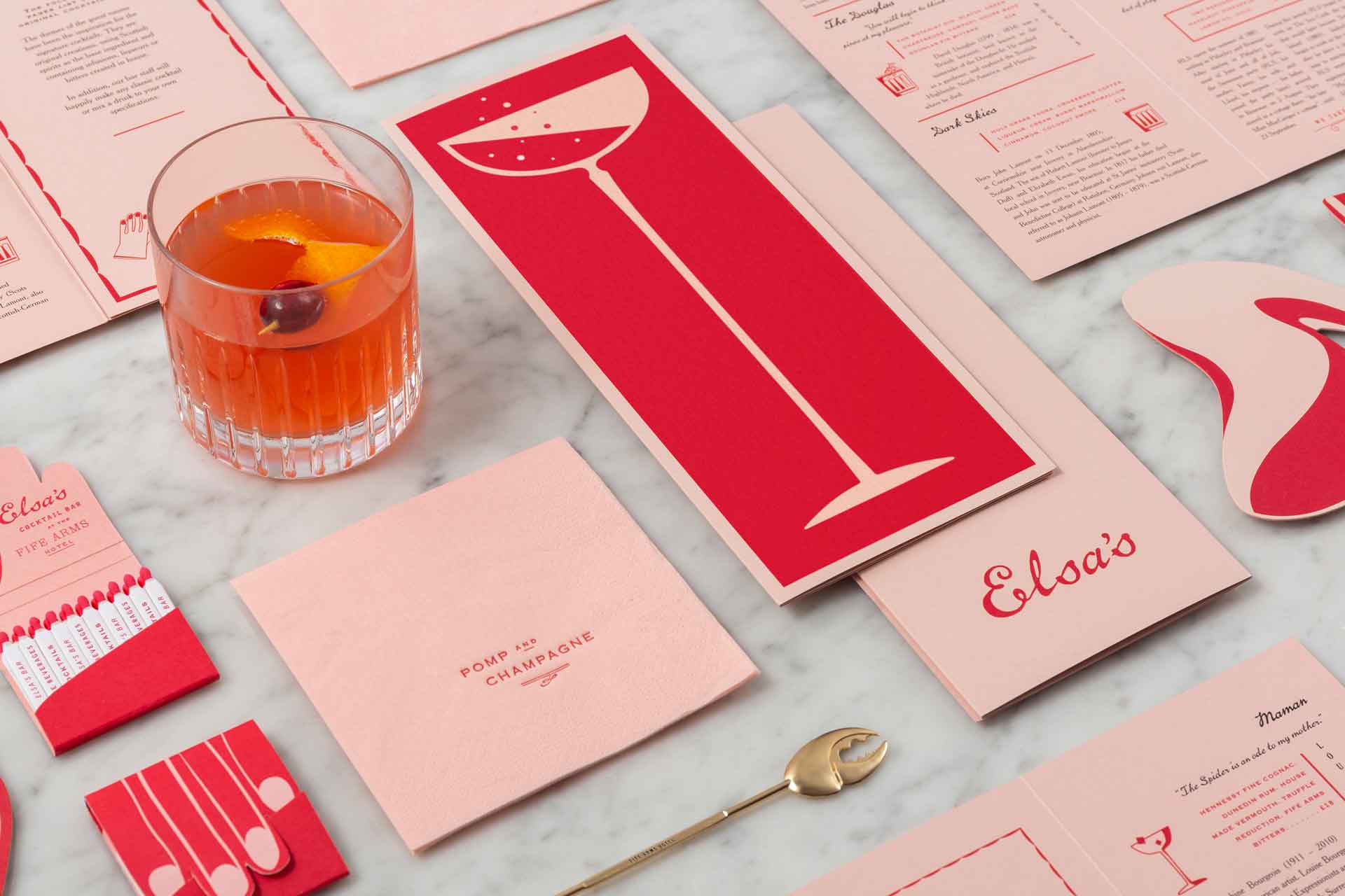
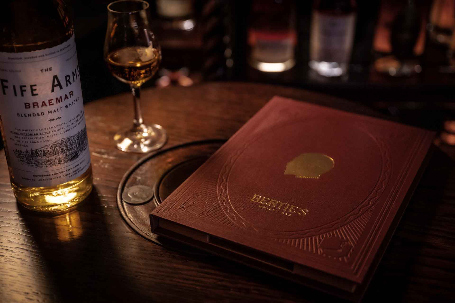
Here Design are behind the visual identity of The Fife Arms in Scotland and are responsible for creating its holistic identity across its bars and restaurants including the hotel’s new venue, Bertie’s Whisky Bar, a library of whisky inspired by King Edward VII, who was affectionately known as Bertie and his hedonistic love of opulence.
We recently caught up with Mark Paton and Tess Wicksteed to learn more about the design studio, the role of visual identity in bringing F&B concepts to life and the inspiration behind their latest projects.
What are some of the most memorable projects you have worked on in the hotel F&B sector?
Our design work in the F&B world is incredibly varied – we’ve collaborated with chefs, restaurants, hotel groups, curated the luxury redesign of catering company Rocket and even created identity for Arijiju, a progressive safari lodge in Kenya. Many incredible memories have been made along the way, and we’re honoured to maintain long-standing relationships with true food pioneers like Yotam Ottolenghi, Nigella Lawson, Jacob Kennedy and Stevie Parle.
We’ve also created the identities for some of the most iconic restaurants we all know and love today, including Hide, The Palomar, NOPI, Bocca Di Lupo and Gelupo, Within the hotel sphere, we’ve worked with The Fife Arms, and recently unveiled our design for the new Bertie’s Whisky Bar, as well The Hoxton and Soho House. It’s truly special to be able to create the fabric and DNA of places that are so iconic and filled with memories for so many people.
What are the most important factors in creating an impactful brand identity for hotel and F&B brands?
It’s a very particular sort of branding because while you want it to be distinctive and iconic, you also want to be able to live inside it and for it to have depth and flexibility. As a guest the last thing you want is for a place to feel too branded. The same is true of restaurants, as you’re designing an ecosystem that should be capable of sharing many different experiences and moods and discoveries. You need this very light touch that creates a feeling of belonging – creating a place that knows who it is but that is not too brash. There’s nothing worse than a hotel that crudely asserts its identity all the time, interrupting your experience like some sort of boorish egotist.
Why is branding in the hospitality industry so important?
Identity is the aspect that creates character and forms a relationship with its guests. It’s that all important layer that talks to you over and above the people who run it both visually and verbally. Through the identity you get to know a place and that creates a sense of belonging.
What sets Here Design apart from other design studios?
Probably the multidisciplinary nature of our practice. Working together from very different starting points (thinkers, writers, designers of all sorts and makers) means we are a simulacrum of the guest experience, from thinking about the space, to the things they touch and to the things they read. There’s still a lot of siloed thinking in the design world and it doesn’t help create a joined up experience for the guest. Real collaboration between different disciplines and perspectives is more challenging than the rhetoric allows but ultimately it is the only way – it’s the biggest challenge of our times in and out of design.
Could you tell us about your work with The Fife Arms Hotel on the visual identity of its F&B venues?
The Fife Arms really is an ecosystem because it is a celebration of all the stories and people who visited Braemar – a pretty glamorous and extraordinary lot from Elsa Schiaparelli to flying stags (with real wings!).
The idea behind Artfarms, that is the hospitality wing of Hauser & Wirth, is revealing a deeper engagement with place that is embodied throughout, from the uniforms to the logo. Working on what role the identity could play was quite a head scratcher because you have this incredible modern art throughout the space, a rich history full of wildly interesting characters and then Iwan and Manuela who encourage free-reign of imagination in all things. Many hours were spent scouring boxes and boxes of material at the Braemar historical society.
We had to practice restraint and imagination in equal measure – to curb a few excesses and indulge others. The result balances an exuberance of styles, periods and characters into a coherent experience with each new room feeling like part of a seamless whole.
Could you tell us about the branding you have done for the hotel’s new bar?
Yes, it has been such good fun! The much-awaited reopening will include a new whisky bar called Bertie’s. As with all of the spaces in The Fife Arms, there is a real theatricality and richness to the inspiration behind the space – in this case it was Queen Victoria’s eldest son, King Edward VII. We wanted the design to reflect some of the stories and anecdotes associated with Bertie. And as with all of the design for The Fife Arms, we’ve embraced idiosyncratic and characterful typefaces and illustrations, and also helped to create a series of bespoke products that make the rituals at the bar that little bit more special.
What other projects have you been working on recently?
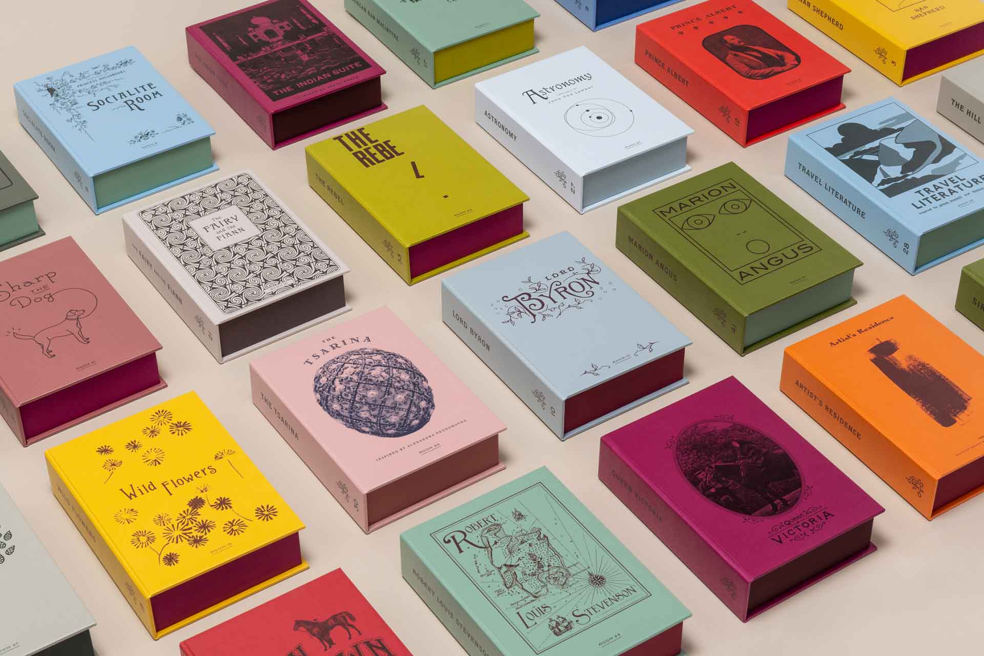
We’ve just completed the identity for Jiji’s, a new Israel-Japanese restaurant in London’s Islington Square by Janina Wolkow opening this June. Here have also designed Gelupo Gelato, a new ice cream recipe book by Jacob Kennedy. It’s a real immersion into the world of the much-loved Italian delicacy and we’ve really injected some fun into the book’s colourful pages. The studio is also hard at work on new hybrid cultural-wellbeing centres within stately homes, one of which is focussed on the idea of slow living which is incredibly interesting to explore through design.
At present, what do you think dining venues and F&B brands are looking to convey through their wider brand identity?
Brand identity is an enigma because it is everything and nothing at the same time. It has to represent the place and its culture but is not it. It can give authority and presence but it can easily appear to be a veneer that glosses over an experience, rather than genuinely coming from it. Most of our clients are concerned with communicating authenticity, and our belief is that you can only capture the soul of a place in an identity that is deep, not shallow. It must have real character that is built through words, distinctive elements and design behaviours that are symbolic. We often start an identity project with a symbolic object, like the NOPI napkin ring or The Fife Arms egg scissors and work out from it.
Linked to that, what are some of the demands of the sector in today’s climate?
We know that hospitality is so excited to be back in action – it has been really bleak, but there are lessons to learn from this shared experience, rather than simply reverting back to our pre-Covid ways. Enriching our at-home eating experiences and the many digital iterations that brought the feel of dining out into the home are aspects we hope stay. Design and identity will be even more so important as we navigate our way to the future, with restaurants really honing their experiential credentials.
Looking ahead, where will you be looking for inspiration when creating visual identities for hotels and F&B venues in the future?
It is an incredibly exciting time to be working with Hotels and F&B concepts. After this prolonged period of restriction, we anticipate a lot of pent up desire for dramatic and memorable real world experiences that really celebrate what it means to be together again. At the studio we’re constantly talking about striking a more conscious balance of online and offline interactions, but also allowing ourselves to imagine how we can make the most of physical experiences to reset and offset all of that time sat in front of glass screens. We’ve all been taught a valuable lesson in the preciousness of communal experiences. We will be looking for inspiration in this energy.